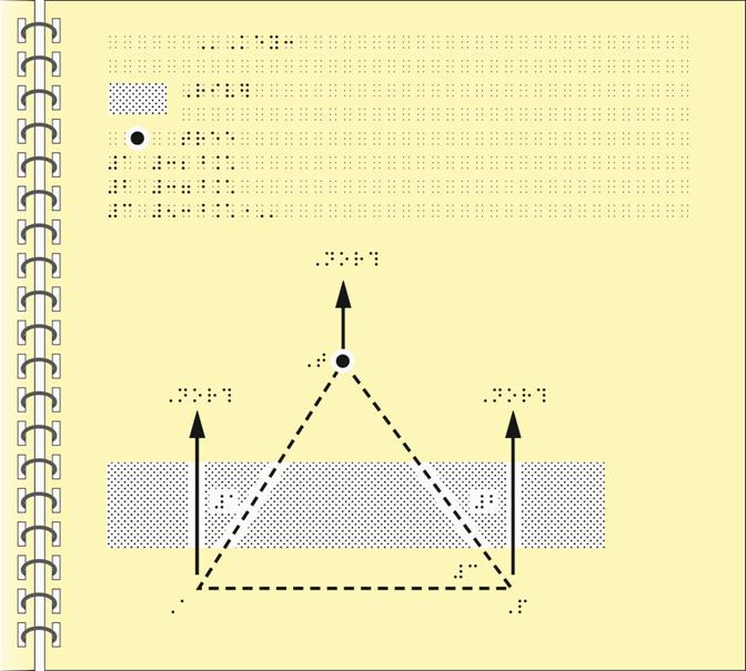
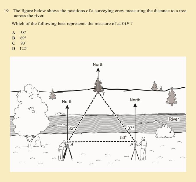
Example of Tactile Graphic Design:
Angles on Survey Map
The following points indicate the braille code, format rules, and design techniques that were used for this tactile graphic example.
- Nemeth braille code
- use of blank space around labels and lines (2.11)
- use of area texture to show print shading (3.1.1, 3.4.3.1)
- use of arrowhead on directional arrows, as in print (3.4.3.7)
- placement of labels for plotted points (3.4.3.11)
- simplification and elimination (3.6, 3.7)
- order of key listing (5.7.1)
- capitalization and non-capitalization of explanations (5.7.4)
- use of numeric key listing, numbers of key are literary when using Nemeth braille code for main text (5.8.2.5)
- use of area and point symbols in key listing (5.8.4.3, 5.8.4.4, 5.9.1, 5.9.3)
- non-use of letter sign on capitalized letters used for labels (5.10.4)
- use of varying textures of lines (6.11.1.1)
- use of dashed line texture for triangle, distinct from solid arrow shafts (6.11.1.1)
- use of keyed labels to conserve space inside angles (6.11.1.6)
Angles on Survey Map

Angles on Survey Map
