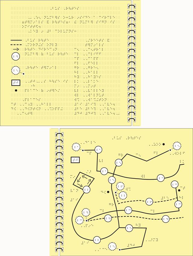
Example of Tactile Graphic Design:
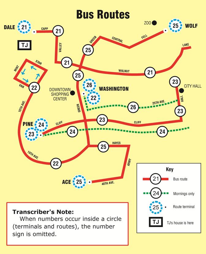
Bus Routes
The following points indicate the braille code, format rules, and design techniques that were used for this tactile graphic example.
- literary braille code
- use of different textures for crossed lines, no blank space required (2.11)
- use of blank space around plotted points (2.11, 3.4.3.11)
- use of facing pages for key and tactile graphic (2.20, 5.8.3.2, 7.3.10)
- use of different textures for circled routes and terminals (3.4.3.1)
- use of open arrowheads on arrows (3.4.3.7)
- use of indented headings for lists (5.3.2)
- use of transcriber's note indicating omission of number sign on bus routes and terminals (5.6.1)
- incorporation of print key into tactile graphic key listing (5.6.1, 5.6.2, 5.7.5, 5.8.4.2)
- use of line and point symbols in key listing (5.8.4.3, 5.8.4.4, 5.9.2, 5.9.3)
- capitalization in the key listing follows capitalization in the print graphic (5.7.4)
- use of alphabetic key listing (5.7.1.4, 5.8)
- use of runovers in key listings, indented 2 cells to the right of the line above (5.8.4.5)
- use of two columns for key listings, to fit on one page (5.8.4.9)
- omission of capitals on some labels to allow use of full words rather than using a key (5.10.3)
Bus Routes

Bus Routes
